Hello! We’re Triangular Pixels and we’re prototyping a Responsive Content Generation Tool. The goal is a system that will generate VR content specific to a player’s device, location (play area), physical and mental abilities. That way games will adapt to players rather than players having to adapt to games. The prototype will focus on the physical accessibility of immersive content
In 2016 we created Unseen Diplomacy, a room-scale VR game designed as a physical assault course. In it we created a system we call Environmental Redirection, which was a great success in terms of accessibility and immersion. But it wasn’t without its problems – many of which we aim to solving using our new tools and authoring techniques.
The original game’s rooms were all hand authored. As a designer, making a room consisted of me creating geometry unique for each wall, floor, roof and and the bits in between. This was a frustrating process – meaning rooms were slow to make and very prone to human errors. It’s an unscalable system where any changes or iteration to geometry will always cause lot of changes or bugs, and limited how many rooms could be make during development time. The only way to increase output was to throw more people at it – or rethink how we author content.
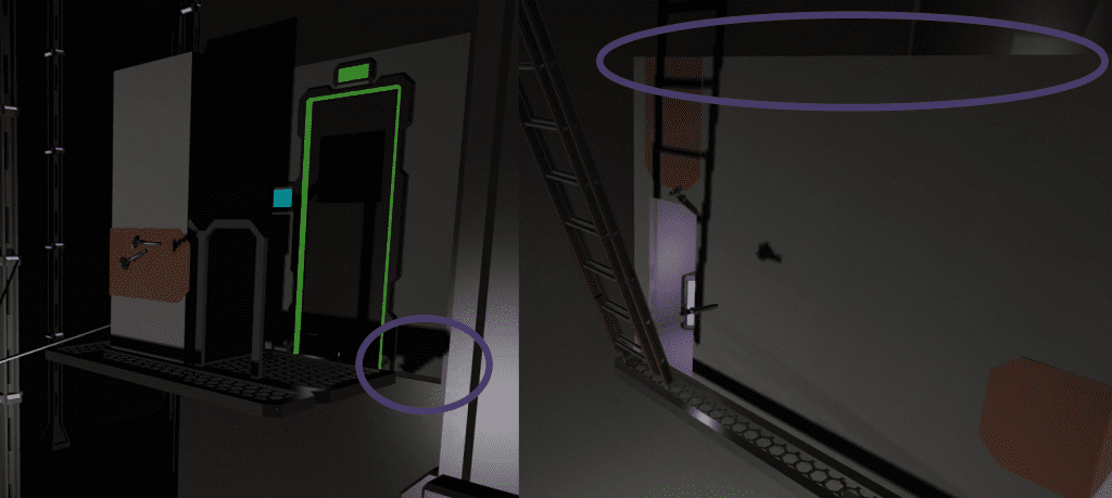
Our new tools and the portaling tech will allow us to create scalable content at speed – but on top of these new tools there is also the method of creating “modular content” which can be used on top of our new tools. The theory is that artists create essentially prefab or lego pieces, and designers fit them quickly together in a level editor. It’s how many classic 2D games such as Super Mario or 3D games like Skyrim are created. And just like Lego, fitting together pieces you can make something bigger and more interesting than its parts.
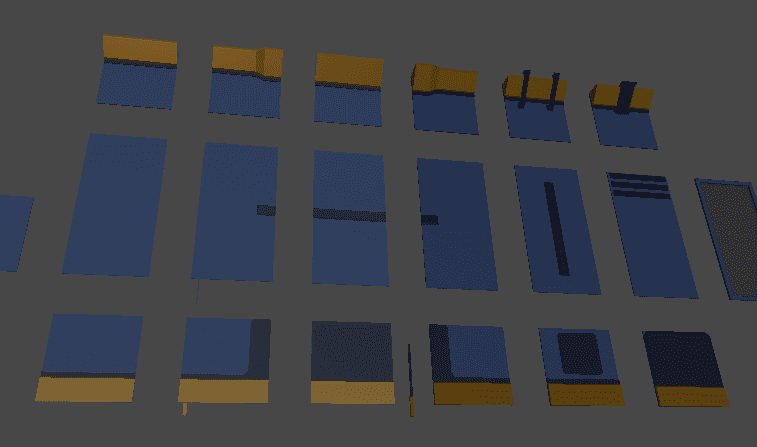
With modular content, pieces (or tiles in our case) can snap together in all sorts of ways. This means you only need to create a core palette of pieces and mix and match how they are used to make something unique – which makes for a great way to build large scale content efficiently. Because designers are just placing tiles, it’s easier to make dramatic changes within an area by just swapping out a few pieces.
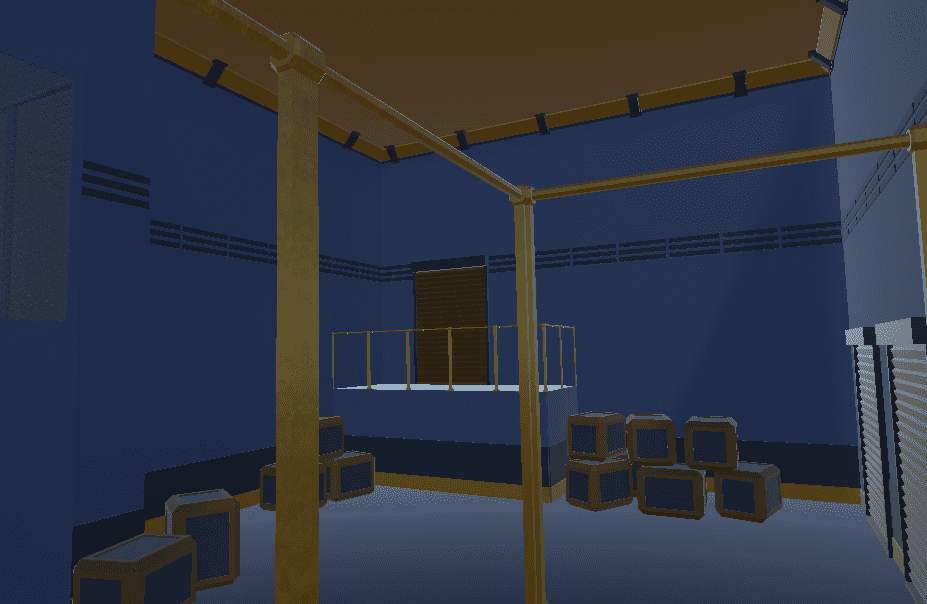
One of the bugs you may see on hand created content is holes in the geometry – little gaps meaning the room isn’t water tight. These gaps are much easier to spot in VR thanks to the stereo vision and much greater camera freedom. Modular tilesets helps to ensure that scenes are watertight as everything is designed to snap together and leave no gaps. Fixes or changes to one tile can be made and that one fix will apply immediately to the whole game rather than having to manually update each scene.
Creating modular tiles is also very scalable in itself. You can make a small tile set and reuse pieces – and later on, at any point, you can make just add new tiles to the tileset. This gives designers more choice for content created in the future and artists can work at their own pace.
Sorting the Scale
The first thing to decide when creating a modular tileset is how fine grained we want the pieces to be. What isn’t important is the physical size of the pieces, but the relationship between them. In some ways, our first game had large modular tileset as it was at room level – I would make rooms and they would fit together. You can go smaller by making modular walls, parts of walls, or even lower. There are two important trade-offs to consider:
- If pieces are conceptually too big the designer has no control over the aesthetics of an area due to lack of combinational choices, everywhere may look the same, and it may even be quicker to hand author scenes.
- If pieces are conceptually too small or too fine grained, then the designer is really hand authoring things just with a slightly more constrained pallet than a poly editing tool/3D software. This will reintroduce the problems of hand authoring such as speed and reliability. For the artists the number of pieces they have to make grows exponentially ending up in an uncontrollable amount of assets to manage.
It’s a careful balance to allow designers and artists as much free reign as possible, but while keeping the benefits of a modular system.
A Strict Naming Scheme
As you start to build pieces, you need to immediately start thinking about naming the files. A big challenge with modular sets is managing the number of assets and how to find them, so you need to make this easier by having a clear language in your naming – note the fact that each lego piece has a code rather than described as a “4 stud red brick”!
What we’ve found is that colours and sizes are very hard to describe. You may start off with “big_blue”, “small_blue” – but if you are adding more pieces you may decide to add more types of blues, different sizes between big, small, medium. You will end up with names like “biggerbig_lighterblue2” which just become a mess. We keep sizes in names to world units (e.g. 2×5), and colours completely out and go by the use of the object instead.
We also structure our names so that they go from most general to most specific within the filename. This provides a clear hierarchy to the name. Every naming scheme will have different elements that it needs to include, but ours looks like:
- Scheme, this defines what spec the piece is following
- Type, the tiles usage such as wall/floor/decoration/etc.
- Size, rounded up to nearest unity units eg. 2×4
- Name, to distinguish this particular piece
- Variant (optional) to distinguish minor variants of the same piece that are otherwise identical.
So a wall piece might end up with the full name of WallS1_CenterFill_2x2_A_Variant1
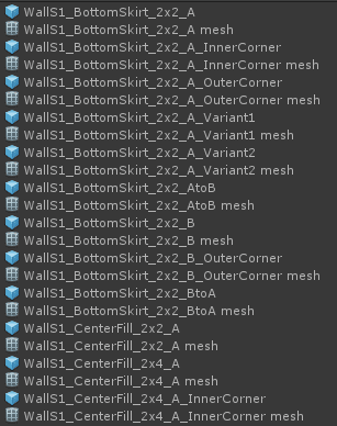
For materials we add a ‘UD’ prefix at the front as so many third party tools come with materials (and the Unity search function is terrible at filtering!), and it’s very easy to accidentally make changes to a material you thought was just on one object but actually is used on many. The naming scheme turns into something like UD_Env_Primary_A_Metal. This makes it clear that it’s one of our materials, and where it’s being shared and used across the game.
Again it’s a balance between having names that are too short so not useful to filter and find pieces with, and making the names so long that it takes a long time for someone to parse and understand the piece they are going to use.
Making the Pieces
There’s plenty to think about when you are actually creating your pieces! There’s a lot of resources out there to help. Some of the things we’ve found when making our own content so far are;
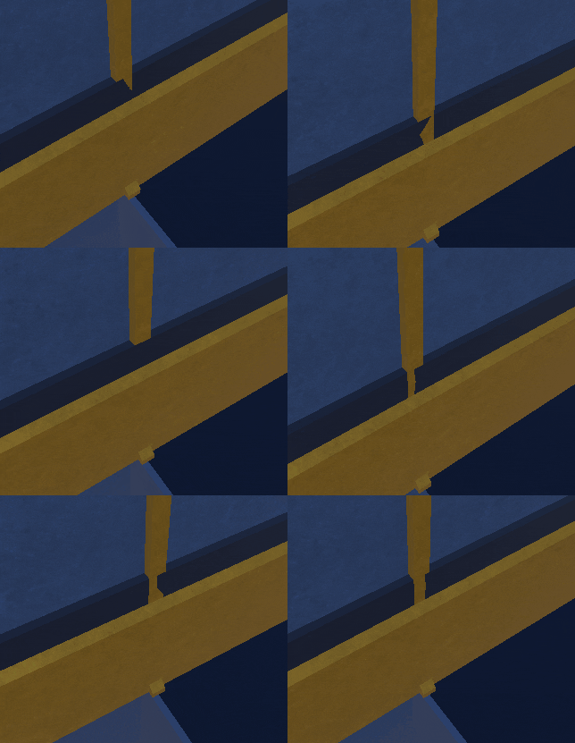
Your main enemy is z-fighting – where two pieces of geometry overlap in exactly the same space leading to flickering. If you snap everything to a grid – your edges will be exactly aligned so will introduce a lot of z-fighting. You will therefore need to design pieces that snap together but don’t overlap, or you will have to create corners, bevels or edge pieces to cover or replace those z-fighting tiles.
To add to your tile set you’ll hopefully be adding lots of interesting variants. You’ll also have to potentially create transition pieces – going from one style of tile for another.
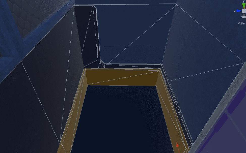
And we’ve found that making our individual tiles more watertight in themselves, so each tile feel solid, has back faces and sides, allows them to be used in more spaces and keeps away geometry gaps in the final scene – just potentially at the expense of needing to make sure to add those transition or cover pieces.
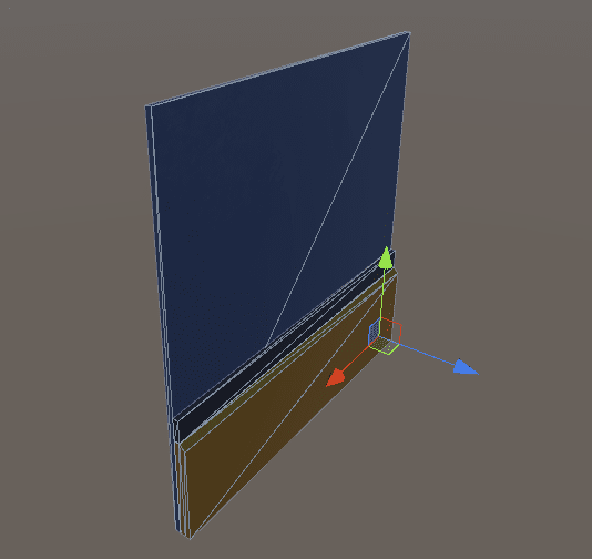
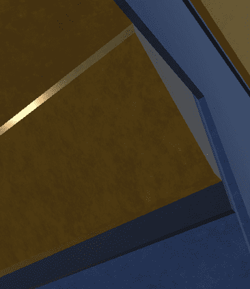
Finally – we created an exporter tool to make sure we keep naming and authoring consistency, allowing all our tiles to keep snapping together nicely and minimizing possible human errors. It also allows us to go back and forth after export, and iterate on the tile without needing to redo a tile entirely from scratch or change placement that has already happened. It’s really crucial to try and keep this ability to edit previously exported objects so not to get stuck in a one way flow where you can’t tweak and iterate on designs.
Making the Pieces
We’re still iterating on all the pieces we need and the final quality pass of them is still to come. It’s only when you really start making content with your modular tileset where you discover pieces you have missed – so we’re busy making a few test levels. It’s worth us making sure that new asset types in the game keep to naming conventions, we do have to keep consistent. And in terms of our tools we eventually would like to expand our builder and export tools so that every night all our pieces are automatically re-exported and checked – so covering us in case of any human errors in forgetting to re-export a piece and help prevent introducing bugs.
We can’t stress enough that it’s really important to set off on the right foot when creating modular content – otherwise you’ll find yourself recreating assets, renaming and reorganising, and generally having a lot more work to do if you try and leave tasks until later. If you’re interested in modular content creation hopefully this post has helped with that, and feel welcome to join the conversation on our own blog and Discord.

